Designing Multitouch for Children: Lessons from the Living Mural
While researching multitouch applications for kids, I came across an interesting blog post about the Crocker Art Museum in Sacramento, California. This turn-of-the-century museum recently underwent a transformation which included the launch of Tot Land, a dedicated learning space for young children. Its centerpiece is the Living Mural, a giant interactive multitouch wall. I made a special trip to Sacramento to see it earlier this year.
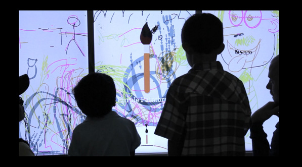
The Living Mural consists of three vertical screens which function as one. In idle mode, a video animation invites visitors to touch to begin. Once activated, the Mural generates “personal drawing spaces” where several children can work independently alongside each other. As they draw, playful sounds, animations and gentle hints appear, providing visual interest and guiding those who might be stuck. Hints and instructions are hardly needed; finger painting is a familiar activity for most young users.
Because children are accompanied by parents, siblings and relatives, designing a child-friendly exhibit is fundamentally about creating an experience for large, diverse family groups. The Mural supports up to 32 touch points which means 4-5 users can comfortably draw at the same time. Jeff Toll, Creative Director at BKWLD, who built the Mural, explains how the personal drawing spaces accommodate children of different ages:
The Mural had to allow for friendly group interaction, removing any frustration or fighting, while capturing a range of attention spans. We were designing not only for toddlers but children of different ages and experiences with technology. Older and more savvy users are more interested in independent interaction; the personal drawing spaces, allow these users to break off and control their own artwork while still interacting and contributing with the group as a whole.
This and other design choices reflect the importance placed on making a space that fit the needs of families. Toll and his colleagues worked closely with the museum’s interior designer to include comfortable seating where parents can watch their children use the Mural without obstructing the on-screen activity.
Limitations and Learning Objectives
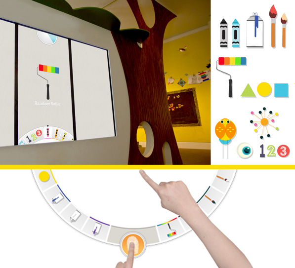
The process of creating artwork on the Mural is open and self-directed, but also constrained. Users cannot select their own brush or pen. Instead, their drawing tool is selected by a colorful dial at the top of the screen. At timed intervals, the dial spins and a new tool is automatically chosen. Users can customize the tool within their own drawing space, but everyone using the Mural is forced to use the same one, and to change tools at the same time. A series of musical tones signal the countdown.
Enforcing the use of specific tools may sound unnecessarily restrictive, but it works surprisingly well. It channels excited activity towards the museum’s learning objective – to reveal how lines and basic geometric shapes combine to form everyday objects and artwork. In addition to brushes, crayons and paint rollers, tools also include letters and numbers and simple pictures.
Interestingly, the Mural was originally designed to be a single, seamless projection. Space constraints forced Producer Donald Fierros and his team to use three vertical screens instead. Testing showed that this adjustment benefitted the project: The three distinct surfaces helped convey the message that the exhibit could be used by more than one person. Poor Flash support for multiscreen displays was the trickiest technical problem Fierros encountered. It was solved through experimentation with video cards and hardware configurations.
Keeping It Simple
What advice would Toll give to other multitouch designers? Keep it simple and intuitive. An early design of the Mural included gestures, but they were eliminated to keep the interface as simple possible. The use of familiar drawing tools and animations ensure children “recognize, associate with, and can instantly play without any adult guidance.” My own experience with the Mural confirmed that it encouraged users to try things out, to learn the interface by doing rather than waiting for instructions. When my companions and I shared our discoveries, this made the experience a social one – the essential quality of a successful multiuser experience.
by Shelley Mannion ![]() on August 30, 2012
on August 30, 2012

