Blog
Human Computer Interaction in Informal Science Education Conference (HCI+ISE)
Exciting news! We just received funding from the National Science Foundation to host a conference on human computer interaction in informal science education. HCI+ISE will be held June 11-14th 2013 in Albuquerque, New Mexico. Kathleen McLean from Independent Exhibitions and I are the co-Chairs.
Below is the abstract, the award is posted on the NSF website.
This conference brings together 60 people in May/June 2013 to discuss opportunities and limitations in the use of the latest in Human Computer Interactions (HCI) in museum settings, such as experiences using Kinect, Wii, multi-touch computer-based systems and voice recognition interfaces. Given that HCI is increasingly being used in museum settings, the conference will examine some of the exemplar exhibits that now exist and explore some design challenges regarding the use of HCI in museum settings.
Participants at the conference include an interdisciplinary set of experts (science exhibition development experts, learning science researchers, ISE evaluators and multi-media experts) that will take a critical look at the future needs and appropriate application of HCI in museum environments. The conference will explore both the advantages and limitations of HCI use in museum environments, and will concern itself with both the nature of the hardware and the learning that can occur.
A final report will be disseminated via a multi-user blog that will encourage participation/discussion and the conference leaders will encourage the development of a Community of Practice regarding the use of HCI in museum settings that builds from the existing Open Exhibits web site and Open Exhibits membership.
We will be posting more on this conference here on the Open Exhibits blog, including information on how you can apply to attend. You can now apply here: /research/hci-ise/apply/
Designing Multitouch for Children: Lessons from the Living Mural
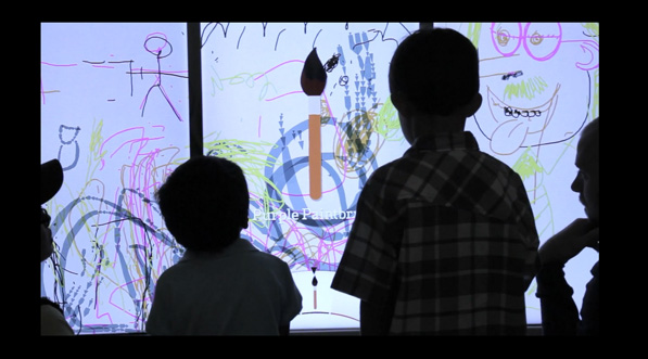
While researching multitouch applications for kids, I came across an interesting blog post about the Crocker Art Museum in Sacramento, California. This turn-of-the-century museum recently underwent a transformation which included the launch of Tot Land, a dedicated learning space for young children. Its centerpiece is the Living Mural, a giant interactive multitouch wall. I made a special trip to Sacramento to see it earlier this year.
The Living Mural consists of three vertical screens which function as one. In idle mode, a video animation invites visitors to touch to begin. Once activated, the Mural generates “personal drawing spaces” where several children can work independently alongside each other. As they draw, playful sounds, animations and gentle hints appear, providing visual interest and guiding those who might be stuck. Hints and instructions are hardly needed; finger painting is a familiar activity for most young users.
Because children are accompanied by parents, siblings and relatives, designing a child-friendly exhibit is fundamentally about creating an experience for large, diverse family groups. The Mural supports up to 32 touch points which means 4-5 users can comfortably draw at the same time. Jeff Toll, Creative Director at BKWLD, who built the Mural, explains how the personal drawing spaces accommodate children of different ages:
The Mural had to allow for friendly group interaction, removing any frustration or fighting, while capturing a range of attention spans. We were designing not only for toddlers but children of different ages and experiences with technology. Older and more savvy users are more interested in independent interaction; the personal drawing spaces, allow these users to break off and control their own artwork while still interacting and contributing with the group as a whole.
This and other design choices reflect the importance placed on making a space that fit the needs of families. Toll and his colleagues worked closely with the museum’s interior designer to include comfortable seating where parents can watch their children use the Mural without obstructing the on-screen activity.
Limitations and Learning Objectives
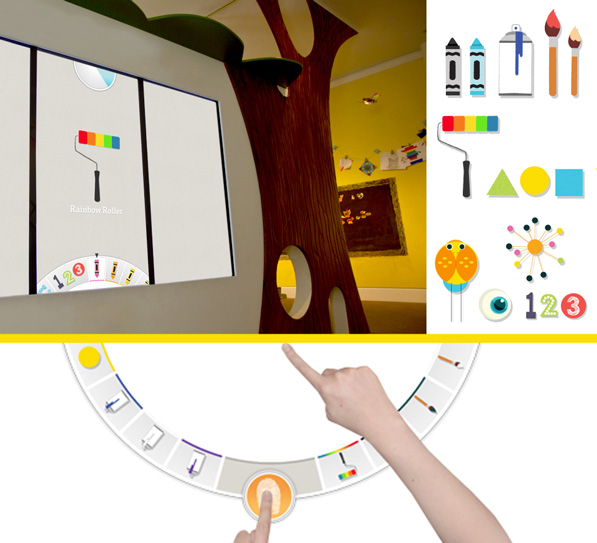
The process of creating artwork on the Mural is open and self-directed, but also constrained. Users cannot select their own brush or pen. Instead, their drawing tool is selected by a colorful dial at the top of the screen. At timed intervals, the dial spins and a new tool is automatically chosen. Users can customize the tool within their own drawing space, but everyone using the Mural is forced to use the same one, and to change tools at the same time. A series of musical tones signal the countdown.
Enforcing the use of specific tools may sound unnecessarily restrictive, but it works surprisingly well. It channels excited activity towards the museum’s learning objective – to reveal how lines and basic geometric shapes combine to form everyday objects and artwork. In addition to brushes, crayons and paint rollers, tools also include letters and numbers and simple pictures.
Interestingly, the Mural was originally designed to be a single, seamless projection. Space constraints forced Producer Donald Fierros and his team to use three vertical screens instead. Testing showed that this adjustment benefitted the project: The three distinct surfaces helped convey the message that the exhibit could be used by more than one person. Poor Flash support for multiscreen displays was the trickiest technical problem Fierros encountered. It was solved through experimentation with video cards and hardware configurations.
Keeping It Simple
What advice would Toll give to other multitouch designers? Keep it simple and intuitive. An early design of the Mural included gestures, but they were eliminated to keep the interface as simple possible. The use of familiar drawing tools and animations ensure children “recognize, associate with, and can instantly play without any adult guidance.” My own experience with the Mural confirmed that it encouraged users to try things out, to learn the interface by doing rather than waiting for instructions. When my companions and I shared our discoveries, this made the experience a social one – the essential quality of a successful multiuser experience.
Building with Open Exhibits at ACM ITS Conference
Learn how to build multitouch applications with Open Exhibits: Attend our in-person workshop at the upcoming Interactive Tabletops and Surfaces (ITS) Conference. The event runs from November 11-14, 2012 in Cambridge, Massachusetts. Organised by ACM, the world’s largest computing society, it showcases the latest research and developments in multitouch computing and interactive surfaces. Speakers include leading thinkers and designers in the world of user interfaces from MIT and Microsoft Research.
 The Open Exhibits tutorial on Sunday, November 11 (11:00am-12.30pm) will be presented by Jim Spadaccini, director of Ideum and the Principal Investigator of Open Exhibits, and Charles Veasey, Project Coordinator and Lead Developer of Open Exhibits. Attendees will be introduced to the Open Exhibits project and Open Exhibits SDK (based on GestureWorks) through one of Ideum’s multitouch tables. They will explore the technology and design aspects of multitouch, multiuser exhibit development.
The tutorial will look at examples of multitouch applications built with Open Exhibits and discuss the challenges and possible solutions to the multitouch multiuser tabletop user experience. Topics will include:
- Orientation strategies
- WIMP (windows, icons, menus, and pointers)
- Post-WIMP interfaces
- Tabletop use for low-vision users
Attendees will receive a thorough grounding in the key elements of the Open Exhibits SDK and learn how to create a basic application using the framework. For beginners, the tutorial is a perfect introduction to the software. For those already familiar, this is an ideal opportunity to get up to speed on all the newest features of the 2.5 release of Open Exhibits. Join us in Cambridge!
Open Exhibits at ASTC 2012 Conference
(Cross-posted from the Ideum blog.) The Association of Science-Technology Centers (ASTC) will be hosting its annual conference October 13-16 in Columbus, Ohio. Ideum and Open Exhibits will be sharing a booth (#709) and showing off multitouch and arduino-based hardware and software.
In our booth you can check out the new Platform multitouch table running a variety of Open Exhibits software modules. The Platform is a completely integrated touch table with a 55″ LCD. It supports up to 40 touch points and is 2″ thin. It is the thinnest commercially available multitouch table in the world. With the release of Open Exhibits 2.5 this fall, we will have a lot of new multitouch software to show at ASTC.
We are also planning on demoing our arduino module for Adobe ActionScript and Open Exhibits. This free software module makes it easy to incorporate sensors, lights, buttons, dials, and other peripherals into computer-based exhibits.
We hope see you at ASTC in October! We will also be at the Interactive Tabletops and Surfaces conference, ITS 2012, in Boston in November. We will post more information about that conference very soon.
(The original post: Ideum and Open Exhibits at ASTC 2012 can be found on Ideum blog.)
Designing Open Exhibits for the British Museum
This week, we finalized our designs for two prototype exhibits for the British Museum. In discussing them with the Open Exhibits team, our priority was how to design exhibits that are simple to produce (without ActionScript programming) yet deliver a rich and satisfying user experience. The first exhibit is for a school workshop in the Samsung Digital Discovery Centre, the ICT education space where I teach and the hub of the museum’s digital learning programs for children. The second is for adult visitors to explore the work of the museum’s research scientists in a new laboratory. I’ll cover the first exhibit today.
Reconstructing an Early Medieval Tomb
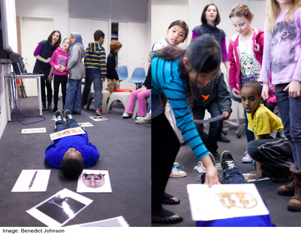
Sutton Hoo Headline is a popular session for elementary schools. It is a video production workshop in which children (age 7-11) make their own news reports about an early medieval burial ground. Children go to the galleries to collect information on mobile phones and then come back to the Centre where they plan, script and film their reports. In the opening plenary, we re-enact the funeral of the Anglo Saxon noble who was buried in the tomb.
A volunteer lies down on the floor, and children place pictures of artefacts on the floor around him or her. The challenge is to place the picture in the correct location according to an illustrated reconstruction of the tomb. This activity familiarizes children with the types of objects in the burial and prompts discussion about them. For example, were objects placed closest to the body more valuable to the person who died, and if so, why?
Adapting a Physical Activity
Our first prototype exhibit adapts this physical activity to a multitouch table. Instead using printed pictures, children will move virtual objects to their correct locations inside the tomb. The screen background will be the illustrated reconstruction that children now look at on a white board. Doing this activity on a multitouch table has advantages:
- Children will have access to metadata about the artefacts (name, description)
- They can interact with more than one object
- With the illustrated reconstruction directly behind the activity space, the spatial relationships between the objects and the tomb will be clearer
- The scale of the objects will be more accurate
I also anticipate that, on the table, the activity will continue to work well for kinaesthetic learners – those who understand and learn through physical movement. One of the strengths of multitouch and gesture in education is that these styles of interaction address the needs of kinaesthetic learners who need to “do” rather than be told. I am frequently surprised by the ways in which technology assists learners who benefit from this physical, hands-on approach.
Doing it in Open Exhibits
Our plan is to use the existing Collection Viewer to create this exhibit. It already contains a number of elements that we need. Images (and other media) appear randomly on the screen to start and can be sorted and moved by dragging. Similarly, in our exhibit, pictures of objects will at first appear out of place and children will drag them to the correct locations. Touching a button on a media element displays related metadata, which needs to work in our exhibit too.
We should be able to implement all the basic functionality in Creative Markup Language (CML) by replacing the existing media with our own and making a few other minor modifications. In future, we could add more complex functionality with ActionScript to give live feedback when children put the object in the correct spot. For now though, we will keep it simple.


