Blog
An Intro to the OE Design Summit Timelines & Mapping Exercise
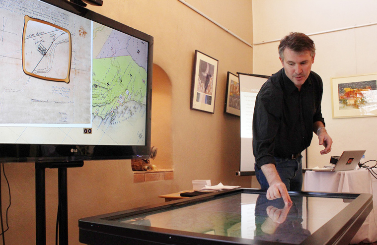
Jim Spadaccini introduced the second day's primary activity on Timelines and Maps, briefly demonstrating use of the L.A. Zone exhibit, a part of which is displayed on an Ideum multitouch table. This application combines multiple tools to allow users to explore the Los Angeles Basin. Users benefit from a combination of KML environmental data (similar to Google Earth) overlaid with geo-spatial data, which results in a precise aerial view of the region. Using fingers to tap a specific location in Los Angeles, available Flickr photos and videos pop up, offering a close-up, ground view.
The Ideum team integrated user-friendly features such as rotating English and Spanish labels on road names and other points on the aerial map.
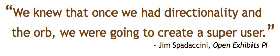
The direction of the maps and the control "orb" created some issues in the multi-user model. "Omni-directional mapping presents a number of challenges. We knew that once we had directionality and the orb, we were going to create a super user," Spadaccini says. Reportedly, some users became confused or got "lost" in parts of the Los Angeles map during time spent on the table.
Summit attendee Kathleen McLean asked whether Ideum had considered expanding this regional exhibit content to the globe. Spadaccini said that Ideum had done this for a corporate client, producing a drafting table model, which made better sense for the inherent single-user interface.
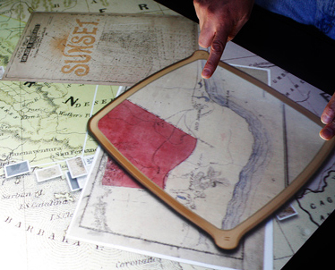 Spadaccini demonstrated other mapping exhibits such as a recent historic mapping exhibit produced for Oakland Museum of California.
This exhibit included a dynamic digital magnifier that could be shared across the table. On a technical note concerning magnifiers, Spadaccini noted that they are currently very CPU intensive and create overlap and boundary issues.
A description of the Mapping/Timeline exhibit design activity can be viewed here:

Erik Lizee Discusses an Open Source Exhibit on the Gulf Oil Spill of 2010
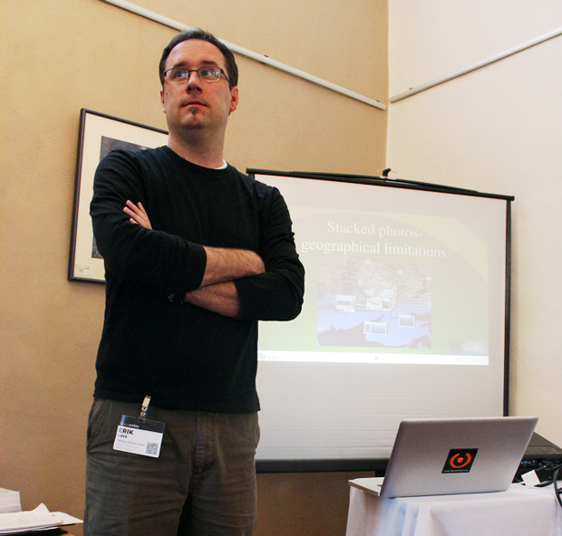
Erik Lizee, Director of Exhibit & Media Development at McWayne Science Center & Aquarium presented on the potential of utilizing real-time oil spill data from NOAA to create an interactive, comprehensive exhibit. Faced with time constraints, they turned to Ideum to help make it happen.

Initially, the display ran into several roadblocks. One was that children were intuitively trying to pinch the maps, the way one would use an iPad or similar device to shrink or enlarge an image. While this feature was fixed to accommodate users, it made the multitouch exhibit unstable. An orb was applied to assist with navigation, making exhibit control a one-handed operation. Map viewing and picture manipulation soon became a gateway for social interaction.
"The person that has control of the board also has control of the photography and people will even tell them, “do this to the photo”!
“Is it a social interaction if one person is saying “Here do this, do that!” says Lizee.
Another problem with navigation of ocean maps was that users didn't have much of a focal point. Unlike maps with roads or landmarks, ocean maps lack markers that can help orient users.
"People will look for a geographical location and will navigate from there" noted Lizee. "Obviously, with the gulfs, having good maps, which this does have, is essential."
The maps of the gulf draw visual content from Flickr. In the California Science Center, the distribution of images is designed for the exhibit. All images used are dedicated to the public domain and come from individual and governmental sources.
The large number of Flickr images results in a "cluster" effect as users try to navigate the table exhibit. This has a tendency to create clutter on the interface. Developers are currently working to increase visibility and provide a cleaner display.
Jim Spadaccini, creative director of Ideum, addressed this by stating, "I think we need to figure out how do deal with the clustering images, how to take another pass at the orb concept and make that a little more intuitive, and figure out if this can be done, whether the data sources are available."
A number of future features were discussed with a goal of creating a more robust template for museums to adapt and deploy. Developers hope to improve the Orb feature so that multiple users could control the maps. They would also like to replace current images with smaller, less intrusive thumbnail-size photos, as well as incorporate more detailed information into the maps. Individual museums will have the ability to empower the public to submit images to the exhibit.
A basic universal mapping app is being prepared for release later this year.
Recipe for an Open Exhibit, an illustration by Lloyd Dangle
We were very fortunate to have Lloyd Dangle, an extremely talented graphic artist and visual facilitator, present at the recent Open Exhibits Design Summit in Corrales, NM.
Over the course of three days, Lloyd made dozens of beautiful illustrations explaining the key ideas and outcomes of the project and Summit - including two wall-sized panels, individual character sketches, and a few drawings that explain Open Exhibits Core software.
Here is a great example:
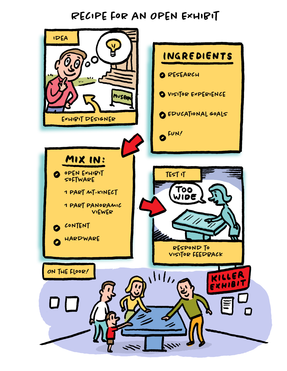
If you like Mr. Dangle's work as much as we do, please check out his long-running comic Trouble Town, or reach out to him directly.
Bruce Wyman Talks Tech During "Breaking New Ground" at the Open Exhibits Design Summit
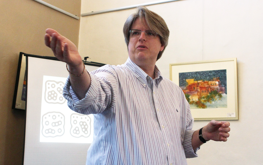
Bruce Wyman, Director of Creative Development at Second Story, delivered a talk introducing a variety of museum-ready technologies borrowed from advertising, marketing and commercial environments.
Wyman is a firm believer that it's incredibly important for technology and museum staff to understand one another. Each world impacts the other. Finding common ground allows for more effective progress and advancement toward common goals.
Mr. Wyman began his presentation by showing a modified pay-phone that visitors could use to call up YouTube videos. The rotary phone dialing mechanism was deliberately ignored and assumed understood, and turned out to be bewildering to younger visitors. Rather than accept this as a negative, Wyman saw this as a positive addition to the exhibit. It started conversations.
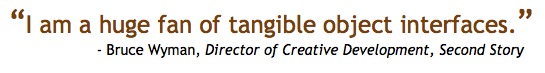
“I am a huge fan of tangible object interfaces,” Wyman says. With that, Mr. Wyman initiated a brief discussion of fiducial markers, physical objects labeled with a unique code that can communicate information such as object position and orientation with multitouch tables and other electronics.
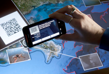
From there, Mr. Wyman began to dig into several code-based technologies, starting from the lowly, traditional UPC bar code and moving into QR codes, which are much richer in information density.
“QR codes are two dimensional,” Wyman says. “They can be read either way. They offer a lot of potential for embedded data.”
QR codes already have a lot of marketing history, mostly in Asia and increasingly in domestic advertising and marketing as people come to recognize and appreciate their value.
Microsoft Tags is a similar technology that allows the information in the tag to change over time. Instead of being limited to the information embedded into the code itself, Microsoft Tags make a server call, pulling the information down on request.
Ralph Das added that the technology exists to add this functionality to QR codes as well.
 Steganography was Mr. Wyman's next topic, addressing the work of the company Digimarc. Long used by spies, in steganography information is embedded into an existing image, audio file or video. This is already in use in advertising.
Omniar, a company offering vision based augmented reality, was also discussed. This technology uses object scanning to pull up information online via a vision based computing device (such as a camera phone).
3-D real-world objects can be identified, crudely but easily scanned, and then tied to online data. A picture of the artifact on your phone can supply you with expanded information about it.
From there, the discussion moved on to robotics and the research on reading facial expressions and facial cues being done at MIT. Object recognition and visitor reaction can be used to monitor and tailor the museum experience for visitors based on their current mood, in real-time.
Mr. Wyman pointed out that Disney uses this technology to control the line length of rides. A recent experiment in robotic interaction in weight control was also discussed. In the weight study, users saw a six fold increase in weight loss when they took a robot home, as opposed to logging their weight loss online.
Slides from Bruce Wyman's presentation can be seen here:
John Llewelyn shares vision of "Future Energy" exhibit
John Llewelyn from the Museum of Science and Industry in Chicago presented an outline of the multimedia and potential multitouch environment in their upcoming "Future Energy" exhibit. The current timeline has research and planning ending in December 2012 with the exhibit scheduled to open in Spring of 2013. This project will be the centerpiece of a 3500 square foot gallery.
Thematically, the exhibit is based around empowerment and providing energy options to a target audience of 8 to 12 year olds. Llewelyn says research on the future of energy so far has been a bit depressing, but the goal is to give users good options no matter how grim the report.
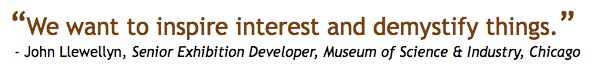
Optimally, the exhibit will focus on three goals: a 50% reduction in CO2, an improved quality of life and increasing demand for new energy resources. Children will be encouraged to explore the relationship between urban, suburban, and rural communities via a multi-user experience.
“The real opportunity for multi-touch is the neighborhood simulation,” Llewellyn says. “Power your neighborhood.”
 Discussion focused on aspects of the depth of the simulation. Jim Spadaccini asked if the exhibit would model economic factors, and Llewelyn said they were considering a range of social and economic impacts.
But how deep are these kids prepared to take this concept? Saul Rockman and Kate Haley Goldman were both interested in whether Llewelyn’s team had any data on the existing understanding of these concepts among the 8 to 12 year-old target audience. Llewelyn says they have been surprised at how sophisticated these kids are. Further research is guiding design choices.
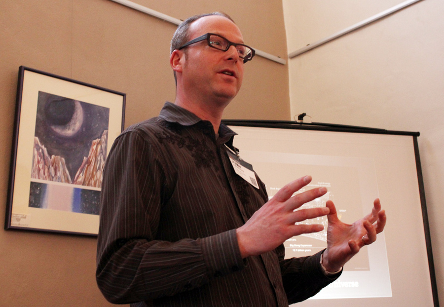
Llewelyn stressed, "We want to inspire interest and demystify things."
Matt Celeskey of NUI suggested they could use The Sims to model interactions and Llewelyn acknowledged Simcity as an original inspiration for the simulation.
Slides from John Llewellyn's presentation can be viewed here: